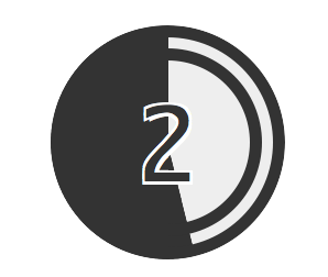
CSS3のanimationだけを使ったスライドショーの勉強をしていて、ちょっと思いついたので作ってみました。
古いフィルム映画の冒頭にあるカウントダウンの参考映像を探したのですが、ちょっと見つけられず。仕方なしに記憶と印象だけで作成しましたので、細部は間違っているかもしれません。
以下が実装済みのサンプルで、mozillaとwebkitで動く様にしました。参考に表示したcssソースでは、ベンダープレッフィクスは省略しています。
なお、このサンプルは10秒でループしているので、カウントが完了しても映画は始まりません。
- 1
- 2
- 3
- 4
- 5
- 6
- 7
- 8
- 9
html
[html]- 1
- 2
- 3
- 4
- 5
- 6
- 7
- 8
- 9
css(ベンダープレッフィクスは省略しています)
[css] #count-down { font-size:5em; font-family:monospace; color:#333; margin:0.2em auto; padding:0; background:#eee; height:2em; width:2em; position:relative; border-radius:50%; overflow:hidden; } #count-down ol { font-size:1em; position:absolute; top:0; left:0; margin:0; padding:0; height:2em; width:2em; border-radius:50%; list-style:none; } #count-down li { font-size:1em; text-align:center; line-height:1; height:1em; width:1em; margin:0; padding:0.2em; border-radius:50%; border:0.3em double #333; position:absolute; top:0; left:0; text-shadow:0.02em 0.02em 0 #fff, -0.02em 0.02em 0 #fff, -0.02em -0.02em 0 #fff, 0.02em -0.02em 0 #fff; opacity:0; animation:number linear 10s infinite; } #count-down li:nth-of-type(1) {animation-delay:9s;} #count-down li:nth-of-type(2) {animation-delay:8s;} #count-down li:nth-of-type(3) {animation-delay:7s;} #count-down li:nth-of-type(4) {animation-delay:6s;} #count-down li:nth-of-type(5) {animation-delay:5s;} #count-down li:nth-of-type(6) {animation-delay:4s;} #count-down li:nth-of-type(7) {animation-delay:3s;} #count-down li:nth-of-type(8) {animation-delay:2s;} #count-down li:nth-of-type(9) {animation-delay:1s;} #count-down li:nth-of-type(10) { animation-delay:0s; background-color: #fff; border: 0.3em solid #fff; } #count-down .progress-half, #count-down .progress-cover, #count-down .progress-cover2 { height: 100%; width: 100%; border-radius:50%; position: relative; } #count-down .progress-half { background:linear-gradient(left,transparent 50%,#333 50%); animation:progress-half 1s linear infinite; } #count-down .progress-cover { background:linear-gradient(left,#333 50%,transparent 50%); animation:progress-cover 1s linear infinite; } #count-down .progress-cover2 { background:linear-gradient(left,transparent 50%,#eee 50%); animation:progress-cover 1s linear 0.5s infinite; } #count-down .progress-cover, #count-down .progress-cover2 { margin-top:-100%; } @keyframes progress-half { 0% {transform:rotate(0);} 100% {transform:rotate(360deg);} } @keyframes progress-cover { 0%,50% {opacity:1;} 50.1%,100% {opacity:0;} } @keyframes number { 0%,10% {opacity:1;} 11%,100% {opacity:0;} } [/css]